But eCommerce mistakes tend to cost a little more than the others.
Let’s stop this madness now!
Mistake #1: Overrating How Many Visitor Will Turn Into Customers
In the brick-and-mortar business, shop owners know very well that not everyone who steps into their store will buy something.
For example, the owner of a shop that sells clothes doesn’t expect 10 out of 10 customers to make a purchase.
But the owner knows that half of them will. Maybe a third of them on bad days.
In eCommerce, things are a little different. The conversion rate is way lower.
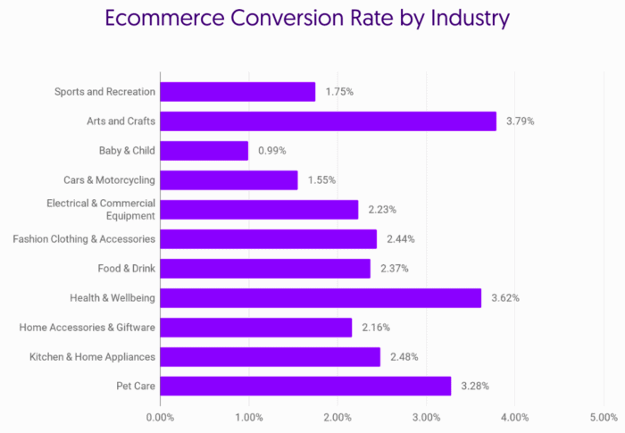
According to the chart, the average eCommerce store shouldn’t expect to turn more than 3 out of 100 visitors into customers.
Many new eshop owners have a hard time grasping this new reality. But in the end, they adop.
Mistake #2: Spending Your Time on Things That You Shouldn’t
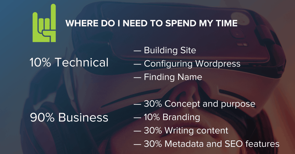
Our number 1 for the list of most common eCommerce mistakes is this. There is a bad habit that was proven to be a common trend – more than it should. During one of the academies of our agency, many eshop owners realized they had been spending their time wrong during the setup of their eCommerce store, and ignoring the most important challenges in eCommerce.
They would spend too much time on trivial -or less important- tasks, like designing their logo when they should be taking care of their content.
As a growth hacking agency, we’ve set up numerous digital properties. What we’ve learned is that time allocation is pretty important, and it should look like this:
Mistake #3: Doing Everything by Yourself
You want things your way, and you don’t share your responsibilities easily. This is 100% respectable, but respect shouldn’t be your top priority right now.
A successful eshop usually does more than one things right: Branding, SEO, PPC campaigns, social media, community management, email marketing, and the list goes on. Even the creation of your eCommerce store can be outsourced. You may choose one of the platforms like WooCommerce, Shopify, or Magento and hire dedicated Shopify developers, for instance.

In our digital days, each one of these activities is a different profession. And if run a small business you may have to fill in many of these positions. Hiring people costs money and money is not infinite, so you end up doing everything by yourself to save money. And this is where many owners make this common eCommerce mistake: they treat time as infinite.
If you want a logo for your business, you usually don’t enroll in a Photoshop webinar, spend 30 hours learning the basics, and then proceed to make your own logo. You can do that, but it’s not very effective.
Similarly, if you want to do marketing for your business, learning and doing everything by yourself won’t be a good idea. Marketing itself is a diverse niche and there are different types of marketing jobs and fields – SEO, social media, PR etc. which require a team of people.
You should think in terms of – what we growth hackers talk about a lot – value. Your time is limited so that begs the question of how can you make the most out of it.
I would suggest doing the things you like the most. If you like designing but struggling with SEO, devote yourself to design and leave SEO for somebody else. Besides the benefit of doing what you like this has in itself, it also allows you to focus on what you do intently, thus becoming more productive in the long run.
If you’re going to delegate tasks to somebody else, most probably they’ll be working remotely. Given this situation, you can let them use a computer activity tracker, which will help you understand how they spend their hours on your project. Especially after the pandemic, there have been developed a ton of remote working tools to help you exactly with this.
Mistake #4: Sending Fewer Emails Than You Should
I can hear you asking: “But Jim, aren’t my customers going to block me if I spam their mailbox daily?” First off, my name is not Jim. Second, let’s talk numbers.
Omnisend has published a research that examines the email campaign frequency for small and medium-sized businesses. According to the results, this is how often its clients send emails per month:
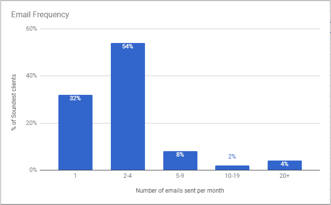
Side-Note: As a rule of thumb, that the bigger the company, the more emails it sends.
And this is how often the audience opens these emails:
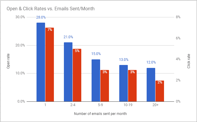
Looking at this chart, we see that open & click-through rates are reverse to the number of emails businesses send. So we can all agree that you shouldn’t send a lot of emails and we can happily move on to the next subject.
Not so fast. Remember:
Your real purpose is not to have the highest CTR & CTOR. Your purpose is to make get the most orders.
Take a look at the next slide.
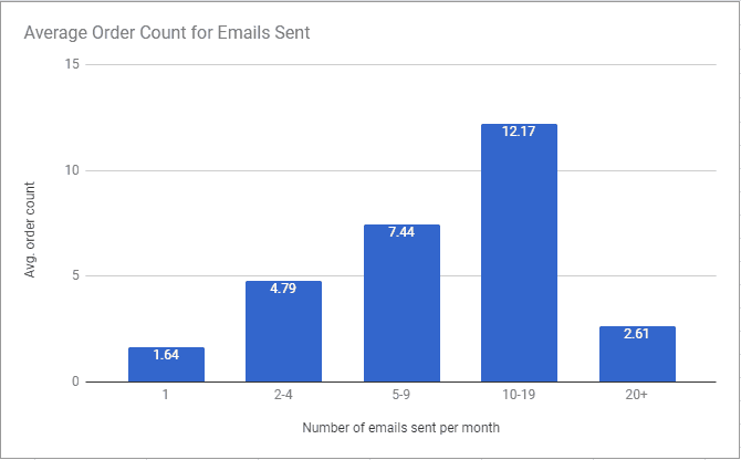
While email frequency increases, CTR & CTOR go down, but orders go up!
At first glance, this may seem like a paradox, however, there is a rational explanation for that.
This explanation comes from the end of the 19th century, from a bright mind you may have heard of: Vilfredo Pareto. In his first paper, Pareto published his 80/20 rule which states that, for many events, roughly 80% of the effects come from 20% of the causes.
Later on, this principle entered the business world and became an axiom in business management, suggesting that “80% of sales come from 20% of clients”.
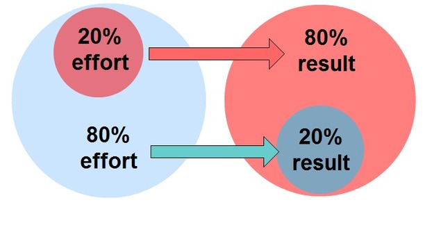
And now our mail results make a little more sense.
But how can you turn this principle in your favor?
With one word – segmentation. By segmenting your audience, you can send the right amount of emails to the right people. You should consider creating two different groups: one with your 20% of customers that buy more often from you and one with the rest 80% customers.
Be very giving to your first group and more conservative with your email frequency to the second. Not segmenting your audience and not taking advantage of the different qualities is one of these common eCommerce mistakes.
Mistake #5: Presenting Products Poorly
Shopping from a virtual shop is usually a less fulfilling experience than shopping in a physical store. Images and words are your only weapons here. So make the most out of them!
a. Words
There is this chair. “How many things can you write about a chair?”
“A lot,” says the copywriter of Wayfair and wrote this:

This description is not telling you about the product – it is selling you the product. Notice how he never mentioned ‘excellent product quality’, which is something you’d see in your standard furniture description.
Therefore, have to take full advantage of your web browser window and make it as interesting as a shop window.
While successful copywriting is not an easy task, it doesn’t require any technical know-how, contrary to images.
b. Images
Product images should be clean and load fast. Thus, your purpose is to have large, attractive images at small file sizes.
During my research on low-quality images on eCommerce stores, I came across some interesting details about how to up your image game for the products on your site.
This is what Sila Mahmud, a graphics designer, and marketing expert have to say. If you haven’t hired a professional for the retouching of the products’ photographs, you should seriously consider applying these:
- Composition: Zoom in on the product. Make it center stage. Whatever the product is, you do not need a lot of walls and floors. If you need a horizon in the picture, have it either one third from the bottom or one-third from the top of the picture. A horizon dividing a picture into two halves makes it boring.
- Background: The subject in your picture should contrast and stand out from its background. You want the visitor to focus on the product, not the background. Your web designer can display the product with the same background color as the web page, provided the background does not contain colors also in the product. (We have seen a product with things accidentally growing out of it).
- Focus: Sharp pictures are usually needed to sell products unless you are selling a misty holiday location.
- Format: JPG and GIF are normal formats for images on web pages. Not all browsers display PNG and BMP. Use GIFs where colors are flat and JPG for most photos. Every time you save a JPG the image quality degrades. Open original JPGs and save in TIF format. Edit in TIF and make the final save as JPG.

- Add borders: This can be necessary to make images the same shape so that they show neatly on a page of products.
- Quality: The original picture must be good, or you will waste hours editing.
- Size: Resize the final image down to the size you want on the website. On 800×600 screens the browser margins leave only about 762 pixels of viewing width, and the viewing height is reduced by the size of the toolbar of individual visitors. Your 2400×1800 pixels picture may end up 400×300 which is why cropping is important to show the product as a big part of the picture.
- Compression: To enable fast loading on the web, JPGs can be compressed. Compression by 25% to 35% can display good pictures, depending on the original. GIFs can be faster loading if the number of colors is reduced from 256 to 16, or whatever number keeps the desired color quality. Keep the image file on the graphics software screen, while viewing the effect in your browser in another window. Use trial and error.
- Thumbnails: A large number of images can be displayed as thumbnails on one page, which can be clicked through to the full picture on another page. You can have two files for each picture, small and full size. The page with thumbnails will load faster. Or the thumbnail page can display the full-size image in thumbnail size by specifying smaller widths or heights in the HTML code.
Mistake #6: Not following the journey of your customer on your site
Time for our last of the most common eCommerce mistakes eCommerce shops make.
For years, eCommerce owners and webmasters were left in the dark as to what their customers were doing on their site. But their prayers were answered.
The Marketing Gods sent Hotjar, Mouseflow, Luckyorange, Zarget, and Inspectlet, among other growth hacking tools. And then a new era in digital marketing began.
These tools allow you to understand your web and mobile site visitors. If we agree that Analytics is about quantity, Hotjar and the rest tools I mentioned are about quality.
I will focus on Hotjar because it’s the most popular right now and if you understand how one of these services work, you have a pretty good idea of how the rest work as well.
So, one of Hotjar’s heaturs is Heatmaps. Heatmaps will give you the ability to see which part(s) of your eCommerce store customers interact the most with, as well as reveal to you the kind of device the user is connected through (desktop, mobile, or tablet).

Recordings can give you real-time insight into how your visitors are navigating through your site. You can even record a session and use it for future reference.
There is also a forms feature, where for each form you have, you can know exactly where and when your customers stop filling them in.
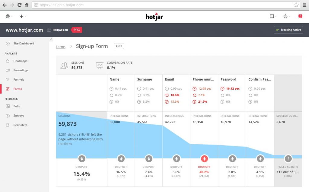
Features like these will possibly give you a good answer as to why your customers won’t complete a purchase. Is your checkout process so complicated long that your customers grow impatient and abandon their purchase? Does a particular page take forever to load and your customers leave? You now can have all the answers.
Information is vital for selling, and eCommerce owners now have more information in their hands than ever.
So, avoid these common eCommerce mistakes and increase the chances of your eshop to flourish!

I write for GrowthRocks, one of the top growth hacking agencies. For some mysterious reason, I write on the internet yet I’m not a vegan, I don’t do yoga and I don’t drink smoothies.


