
However, this same feature will be useless for a law firm which is not selling any physical products online. Regardless of specific features and needs, a common feature critical to the success of all websites is responsive web design and mobile friendliness.
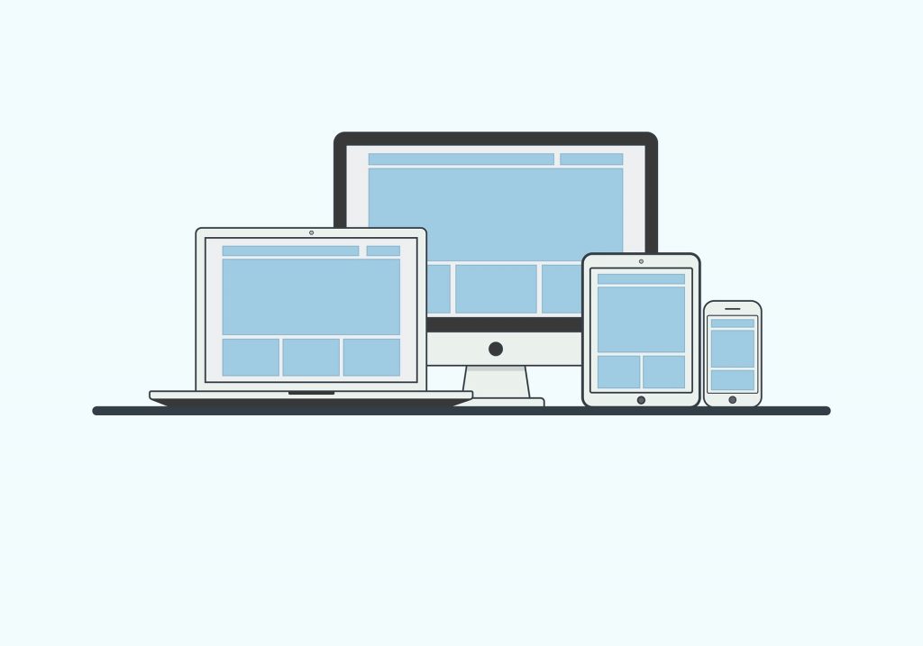
The field of web development and design is now unable to keep up with new devices and resolutions. Creating a different version for each new device or resolution is not only impractical, but also impossible.
However, if a website is not optimized for certain devices, it risks losing out on visitors from those devices. These devices include smartphones, tablets, PCs, and TVs.
Also, let us not forget that people generally use them interchangeably to move through the buying process. For example, someone can browse through headphones through their phone while they commute and make the purchase two days later, in the evening, from their laptop at home.
With the increase in smartphone usage worldwide, responsive web design is a must. Before expanding on web design responsiveness, let’s see what responsive web design really is.

What is Responsive Web Design?
Responsive web design is the approach which suggests that website development and design should respond to the behavior and environment of the user. This includes screen size, platform, and orientation.
It involves utilizing flexible layouts, grids, and images. For example, if a user switches from his laptop to tablet, the website should also automatically switch to accommodate the differences in image size and resolution between the two devices.
This means that the website should respond to the user’s preferences, thereby eliminating the need for different designs for all different devices in the market today. In other words, a wider display should allow viewers to easily browse a site with multiple columns while a smaller screen should have the same content presented in a single column with appropriately sized columns and links.
Mobile/smartphones are slowly taking over the primary way users experience the web. This means that having a responsive website is more crucial than ever.
Web design experts Pelling Design explained the importance of this in their article “Is Your Business Prepared for the Mobile Browsing Revolution” by saying that responsive design that is optimized for multiple devices should be at the top of your “wish list.”
Responsive design does not only mean a consistent experience on smartphones – it includes the way websites work on all screens. Hence, businesses looking to make their web design more responsive should have simpler layouts and streamlined experiences.
Benefits of Having a Responsive Web Design
The benefits of having a responsive web design include:
- Supporting multi-device users to ensure a seamless and consistent experience. This can ensure that users returning to your site from a different device can easily access the same information they were interested in.
- Easier website management. A responsive website means that you don’t have to maintain or worry about updating multiple versions.
- Improved ranking on SERPs. Search engine giant Google recommends using a responsive web design which can support different devices/screen sizes. According to Google, over 50 % of its searches are for mobile devices.
- Responsive web designs ensure future scalability. As responsive sites are fluid, they can easily be scaled up or down as needed to fit different screens. This means that businesses with a responsive site can efficiently respond to new devices with a design suited to a range of screen sizes.
Tips for Ensuring a Responsive Web Design
How can you ensure that your web design is responsive and provides a good user experience across multiple platforms? Keeping these 4 core principles in mind will save you a ton of time (and visitors):
Remove unnecessary content or codes
Remove all redundant or unnecessary content or codes, but retain features which offer functionality. These include product pages, navigation menus, etc.
Design with mobile in mind
As more and more people use smartphones for browsing websites, your website should be mobile friendly. This means that you should design your site for the smallest screen and work your way up.
Ensure that your call to actions (CTAs) are clear and can be easily tapped. Generally, designers also recommend reducing the size of graphics as complex or landscaped images do not display well on smaller screens.
Also, remember to prioritize content using a content inventory which lists all the page rankings and elements based on their importance.

Simple UI
Websites with a complex user interface or special features and rich media do not translate well onto smaller screens. Hence, it is important to keep your UI as simple as possible.
Here are 10 essential UI design tips:
- Know your users
- Define how people use your interface
- Set expectations
- Anticipate mistakes
- Give feedback – fast
- Think carefully about element placement and size
- Don’t ignore standards
- Make your interfaces easy to learn
- Make decision-making simple
- Listen to the data
Intuitive web design
Responsive web design is easy to use across different platforms. To ensure that your website is intuitive, you can use grid layouts, aligned page tabs, left to right page layout, etc. According to WebDesignRankings, an intuitive website should have these four things:
- Easy Navigation
Easy navigation means that while the user is browsing through the property, they shouldn’t think about anything. An intuitive web design should let them know where to go and what to do – instinctively. - Telling the whole story
There isn’t much left to chance, or left out when it comes to the website. Headers are easy to find, and links are available when they are needed. This gives visitors the ability to get exactly what they need when they need it — perhaps before they need it! - Speedy & reliable
Every intuitive website user experience must encompass speed and reliability, i.e., slow loading and broken links. Everything should work smoothly, just as it should. - Strong brand & personality
Web design should maintain and highlight everything that is part of the brand identity and personality, from copywriting to shapes and colors.
Conclusion
Responsive web designs are not only low maintenance, but also provide versatility and a smooth user experience. Therefore, if you want your business to stand out, you should consider consulting a professional web design agency which can help you to build a unique, intuitive and responsive website. Or you can test the responsiveness of your web design yourself with relevant tools for responsive web design testing.
Is your website responsive? And if not, what keeps you from having it?

Theodore has 20 years of experience running successful and profitable software products. In his free time, he coaches and consults startups. His career includes managerial posts for companies in the UK and abroad, and he has significant skills in intrapreneurship and entrepreneurship.


4 Responses
Nice blog
Yes, Its very important to increase the user experience.
Thank god I live where all website are already responsive.
Though every time i design a website, I always design for desktop first. Maybe I should start design for mobile first.
Very Helpful and Informative post.