Product pages. The bread and butter of any eCommerce store. Or, at least, it should be.
Product pages are the most vital part of an eCommerce domain. So how can you make them more effective?
How can you turn your product pages into high-converting product pages? Here are 8 ways to do so.
1. Showcase High-Quality Images and Videos
It’s no coincidence that this is the very first point on our list. We see the product of any eShop as the protagonist and the user as someone who’s come to see the protagonist. So you need to present it to them in the best way possible.
Accordingly, you will have to use high-resolution images to give customers a detailed view of your product. It’s always a good idea to show the product in a video format as well. And don’t forget to include multiple angles and close-ups, too. Make sure to also resize the images you use in case you decide to publish them in other channels as different platforms often have specific requirements.
Also, sometimes, you need to have more than just the product. This is where lifestyle shots come into play, as they help your users visualize the product in their daily lives. For instance, if you’re selling a chair, you can show it in a living room setting or in an office with complementary decor. Additionally, consider using 360-degree photos to allow users to explore the product from every angle.
At the end of the day, high-quality images and videos not only help understand the user how the product will feel and look but it also reduces the likelihood of returns by setting accurate expectations.
2. Use Compelling Product Titles and Descriptions
After the image or video, the next thing most users turn their eyes on is the product title. And then, the description. At the same time, this doesn’t last more than a few seconds so you need to grab your customer’s attention ASAP.
Start with clear, concise titles so that customers immediately understand what you’re selling. If you also aim for organic traffic, you need to include relevant keywords, as part of your on-page SEO optimization.
Next, craft descriptions that highlight the product’s features and benefits. Remember that users don’t really care about the product—they care about how the product will affect them. What this means for you is that you will mention the product’s key features indeed but the most important part is the one that describes how these features benefit the user. Therefore, instead of just listing specifications, you also need to explain how each feature solves a problem or enhances the user’s experience.
For example, if your product is a blender, mentioning its power will only help the user so far. You must add that “it can crush ice for perfect smoothies in seconds”. Additionally, as part of your copywriting strategy, include sensory words that help the customer imagine using the product, such as “silky-smooth texture” or “whisper-quiet operation.” Last but not least, don’t forget to include all the necessary details that reassure customers, such as warranties or return policies.
3. Implement Clear and Prominent Call-to-Action Buttons
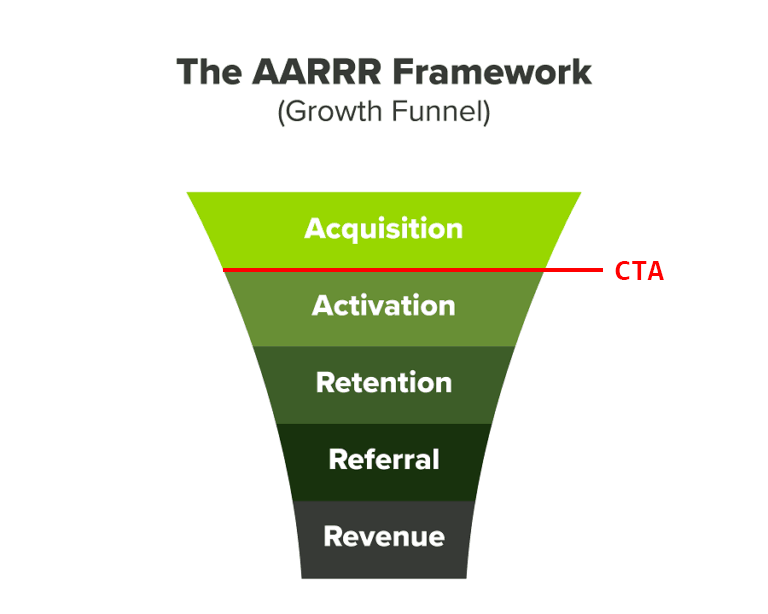
The Final Boss of every page that is looking to convert: The Call-to-Action (CTA) button. This button is what signals the conversion per se. It’s the action that marks the passage of the user from Acquisition to Activation.
A CTA button that converts checks most of the boxes that follow.
1. Text
Your CTA button text needs to be direct and engaging:
- Action-oriented language: Use strong, directive verbs like “Buy Now” or “Sign Up.”
- Concise messaging: Ensure the text is short and to the point, conveying the action clearly.
- Benefit-focused: Emphasize what the user will gain, such as “Get Your Free Trial.”
2. Visual Design
A visually appealing design helps your CTA button stand out and get clicks:
- Size: Make the button large enough to be noticeable but not overwhelming.
- Color: Choose a contrasting color that stands out against the page background.
- Whitespace: Provide sufficient space around the button to make it stand out.
3. Placement
Strategic placement ensures that your CTA button is seen and easily accessible to users.
- Above the fold: Place the primary CTA where it is immediately visible without scrolling.
- Logical flow: Position the button where it makes sense within the user journey.
- Repetition: Repeat the CTA in several locations on longer pages for easy access.
4. Urgency and Scarcity
Creating a sense of urgency and scarcity can motivate users to click at a higher rate.
- Urgency: Include words that create a sense of immediacy, like “Now” or “Today.”
- Scarcity: Highlight limited availability or exclusive offers to prompt quick action.
4. Utilize Urgency and Scarcity Tactics
Continuing from the last point on CTAs, creating urgency and scarcity is not only a strong ingredient for your product page buttons but also the page as a whole.
More precisely, phrases like “Limited Time Offer,” “Only X [Items] Left in Stock,” or “Sale Ends Tonight” can look like marketing gimmicks but when done right, they work. What’s more, you can use countdown timers for special promotions or flash sales.
Additionally, consider using pop-ups that inform visitors of recent purchases by others. These pop-ups play on the fear of missing out (FOMO), which can motivate potential customers. By seeing that others are actively buying the product, visitors may feel a sense of urgency and be more inclined to make a purchase themselves.
That said, you’ll have to be selective with these kinds of tactics and not use all of them at once. The user experience should be above everything else at any given moment, therefore you need to maintain trust and avoid overwhelming your customers.
💡 Read: Top 10 WordPress Plugins to Grow Your eCommerce Store
5. Display Trust Signals and Social Proof
If you are most likely not Apple or Amazon. In other words, your brand isn’t instantly recognizable. We aren’t brand-shaming–we only want to state the fact that if the average user doesn’t know you, then they first need to trust you. This is where trust signals and social proof come in.
Social proof leverages existing customers to attract and reassure new customers, creating a positive feedback loop. In practice, you can include:
- Customer reviews and ratings: Displaying customer reviews and star ratings provides real-life validation of your products.
- Testimonials: Featuring customer testimonials highlights personal success stories that are relevant to specific customer segments, like so –

- User-Generated Content (UGC): Sharing photos and videos from customers using your products.
- Influencer endorsements: Partnering with influencers leverages their credibility and reach.
- Case studies and success stories: Highlight case studies and success stories of your products in real-world scenarios.
Furthermore, you can include internal links to your content on your website. If you’ve created content that is relevant to the product of the page, you can include it somewhere on the page so the user can get more information.
6. Optimize for Mobile Users
Today, there are more mobile shoppers than ever. It won’t come as big news to you that your product pages, as well as your website, have to be mobile-friendly.
A responsive design is the kind of design that automatically adjusts to fit all screen sizes. This way, users have a seamless experience, with easy navigation and fast loading times.
This mobile optimization checklist will help underline the most important actions for mobile optimization:
- Responsive design: Ensure the site uses a responsive design framework.
- Flexible grid: Use a fluid grid layout with percentage-based widths.
- Simplified menu: Use a hamburger menu for easy navigation.
- Sticky navigation: Implement sticky navigation for quick access.
- Touch-friendly elements: Ensure buttons and links are large enough to tap easily
- Lazy loading: Implement lazy loading for images and media.
- Responsive images: Use srcset and <picture> elements for appropriate image sizes.
- Image optimization: Compress images for faster loading times.
💡 Read: Image Optimization for SEO: The Complete 8-Point Checklist
- Clear CTAs: Prominent and easy-to-tap CTAs.
- Simple checkout process: Streamline the checkout process to minimize steps.
- Auto-fill forms: Implement auto-fill and mobile-friendly input types.
- High-quality images: Use zoomable and swipable product images.
- Concise descriptions: Keep product descriptions short but informative.
- Visible Search Bar: Ensure the search bar is easily accessible.
- Advanced Filters: Allow users to filter products easily (e.g., by category, price).
- Mobile payment options: Offer mobile-friendly payment options like Apple Pay and Google Pay.
- Cross-device testing: Test the site on multiple mobile devices and browsers.
7. Simplify the Checkout Process
A complicated checkout process is a bad checkout process. One that leads to frustration and cart abandonment. You need to remember that every action/ form/ button you put in front of your customer is one more obstacle between them and the finish line to complete their purchase. Therefore, you need to simplify and streamline the process by reducing any friction.
To begin with, allow customers to check out without creating an account. Next, don’t ask customers to fill out both a billing address and a shipping address when, more often than not, they are identical. Instead, give them a simple checkbox that customers can click so that the billing address fields are filled out with the information from the shipping address fields.
To take it a step further, consider offering PISP payments, which let customers pay directly from their bank accounts without entering card details or being redirected, making the entire checkout experience faster and more intuitive.
What’s more, offer as many payment options as you can, from credit cards and bank transfers to BNPL. Last but not least, include a progress indicator on the checkout page to show customers how many steps remain, so they are certain of the time they need to complete the purchase.
8. Leverage Cross-Selling and Upselling Techniques
The art of maximizing the value of your customer.
On the one hand, cross-selling is about suggesting related or complementary products that enhance the use of the main item. For example, if you’re selling a camera, then cross-selling products would include accessories like lenses, memory cards, and tripods.
Some of the most common cross-selling techniques include:
- Suggest related products that complement the items in the customer’s cart
- Display “Customers also bought” sections on product pages
- Offer bundle deals that include multiple related products at a discount
- Use personalized recommendations based on the customer’s browsing and purchase history
- Show recommended complementary accessories and items during the checkout process
- Implement pop-ups or sidebars with complementary product suggestions
On the other hand, upselling involves a higher-end version of the same product. For example, if the user is looking to buy the $1,5K camera model, in upselling you are suggesting the $2K one, which is a step up overall.
Some popular up-selling techniques are:
- Recommend higher-end or premium versions of the products being viewed.
- Highlight the benefits and features of the upgraded products.
- Offer discounts or incentives for purchasing the more expensive option.
- Display customer reviews and ratings to showcase the value of the upgraded product.
- Use side-by-side comparisons to show the differences between the basic and premium versions.
- Provide limited-time offers to encourage immediate upgrades.
- Include up-sell suggestions in the shopping cart and checkout process.
Conclusion
Product page optimization is like most types of optimizations: a big checklist that you need to apply and adapt to your eShop, according to its needs.
Do you need any help creating high-converting pages?
Just contact us and we’ll see how our expertise in eCommerce can also grow your business.

I write for GrowthRocks, one of the top growth hacking agencies. For some mysterious reason, I write on the internet yet I’m not a vegan, I don’t do yoga and I don’t drink smoothies.

