“What are some ways to optimize and increase the rate of conversion?” “what are the best ways for conversion rate optimization?”
Oh boy! #The_struggle_is_real.
NO, I am not ironic, IT REALLY IS.
You do not want me to go over all the times that I did an audit for a customer’s website and at first, I could not come up immediately with the best Conversion rate optimization practices for that particular website.
Due to the other countless tasks most times, I ended up like this.
Thing is that Conversion rate optimization is not something to be taken lightly especially given the following:
- The average ROI on CRO tools is 223%.- Venture Beat
- In 2015, 83% of marketers test and optimize conversion rate for call to action buttons, while 77% test page layout. – eConsultancy
- Only about 22% of businesses are satisfied with their conversion rate optimizations. – eConsultancy
- You have only 8 seconds to make a compelling headline. – Interactive Marketing
- 61% of companies run 5 or fewer landing pages test per month. – MarketingSherpa
Conversion rate optimization can be performed in various stages, actions & products of our marketing efforts. Some CROs are easy to be done right of the batt some others demand more testing and effort.
Continue reading and maximize your conversions with these dazzling conversion rate optimization tips.
Copy oriented Conversion Rate Optimization
You would be amazed by how much a difference between a few words can change your conversion rate. Let’s go over changes that mainly revolve around your copywriting & content wherever that may be.
As the super Copywriter Gregory Ciotti (Content Marketing Manager, Help Scout) says “All words are equal, but some words are more equal than others.”
1. Make your CTAs unique
Oh boy! If I had a dollar for all the times I received an email or was on a landing page and the CTAs were like “BUY NOW” or “APPLY NOW”
There is no complex advice that I have for you here, just take advantage of the vastness of your vocabulary.
Align with your companies profile and tone of voice and do not be afraid to play with words, puns and anything else for that matter.
So if you are a business offering services for startups don’t just go for “Hire us now”.
Go for “let us help you” “in need of help?” “skyrocket your startup now”. For all I care you can also go for “Make us your B*tch”. DONT EVEN LAUGH BUDDY!
Always keep in mind thought that they should be clear and simple.
2. Make your CTAs Urgent
Another tactic that I use quite a lot of times. It might be the easy road for some, and I do not know if those psychology things do actually work, but this tactic converts AF.
You can do this by showing time limits or quantity limits: “2 more to go” “Get them for a limited time only”.
But you can also create the urgency with words: “What are you waiting for?”.
You can always test, that is the cool thing with conversion rate optimization: a lot of testing if you want to find the key to conversion success.
3. Reflect USPs in your CTAs
There is nothing better than any action you take to reflect your USPs directly or even indirectly.
As I mentioned above there is nothing that make me close a tab faster than a “Buy now” CTA.
Instead, you can replace that with “I Want my Super T-Shirt NOW” or “Win effortlessly NOW“
4. Switch between First & Second Person Copy in CTAs
A/B test between copies like “I want it” & “Get your very own blah blah”. To be honest, I lean more towards the first person side, but that is just a matter of taste right?
OR MAYBE NOT? Muahahaha
5. Make sure you showcase your social proof
Many people once they hear about social media they think only Facebook or Instagram. Of course, there are various ways to reflect statistics like that on your website.
Jetpack and Monarch are two Wordpress Plugins that immediately pop up to my mind, that can help you do that.
But what I would like you to keep here is that you can take advantage of your actual customers, active readers in this case, as we did here with one of our lovely Client Businessenglishbook.
All you need is Visual Composer and the whole thing is easy peasy. You do not have to go far in order to make killer conversion rate optimizations happen.
6. Aim for rockstar Headlines
The funny thing here is that I could write a whole new article on this subject, but for now let’s keep in mind the basics.
I read a really nice take on Headlines by Nathan Ellering the other day, content marketer at co-schedule. (a tool that we love using here at GrowthRocks)
So I will mix things up a little bit with my own experience and ta daaaaaa:
- Make sure that the Headline answers an answer to a question of the community
- Figure out the type of headline that works for you (e.g. top x lists, how-to guides)
- Mix common words with power words
- Ask a question
- A little drama, aka emotional vocabulary, never hurt nobody
- Go for 6-7 words max
This is one of my most successful articles and I strongly believe that one of the key factors here is the title.
7. Know the audience and counter any objections
I know gosh! Just let me finish. I hope you are not rushing so much as far as conversion rate optimization is concerned.
So if you want to be a little funnier, just put a question in one of your about us section saying “Why should I believe you?” and answer that question in a way only your brand would.
8. Format your copywriting in an eye-catching way
This is not only a copy oriented conversion rate optimization but it is very crucial. Always keep in mind that people do not read your content.
THEY SCAN IT.
Make it as pretty as possible.
9. Make your copy as personal as possible
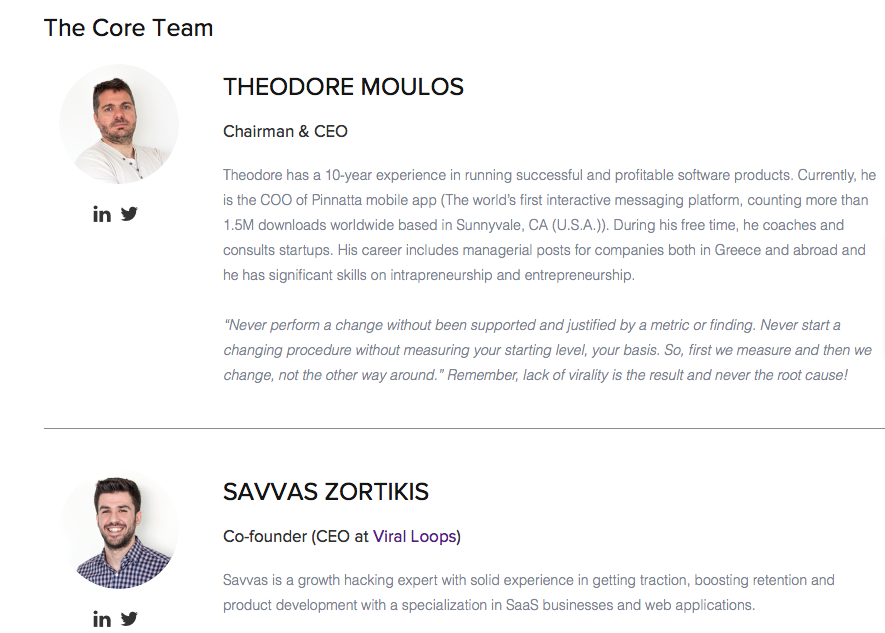
Let’s say you have a landing page specifically for your core team as we do. Just let the team itself write the text and present themselves.
Win your customer over with the true you, a you that will definitely be reflected later on in your collaboration.
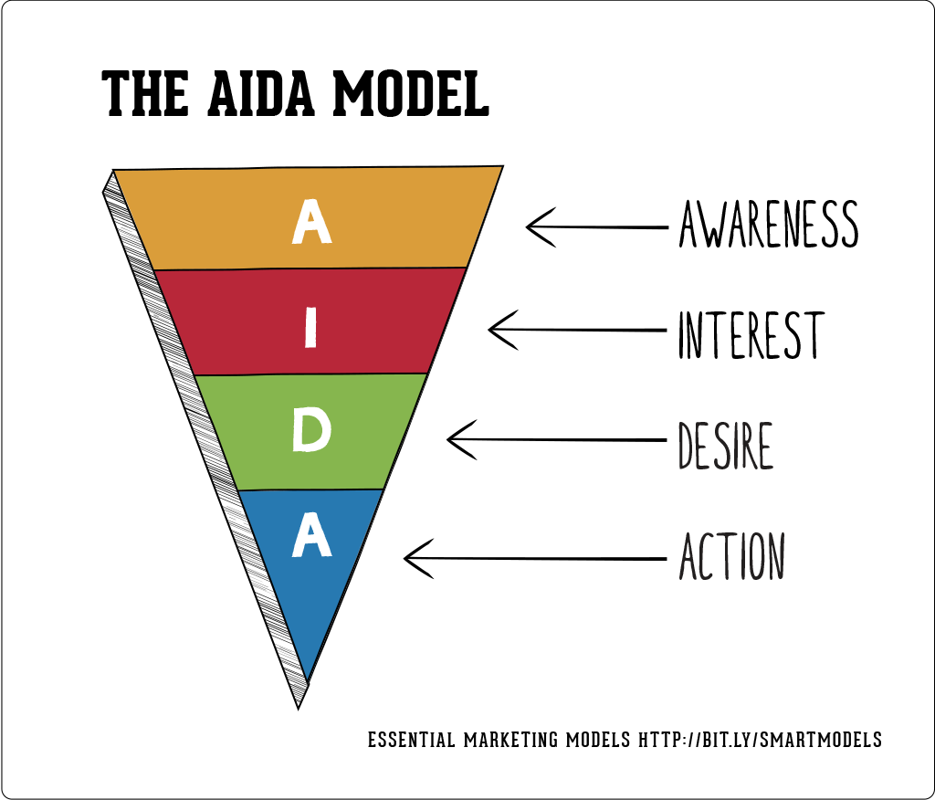
10. Try Copywriting that is based on the AIDA mindset
I think that among many else things Nail Patel has also set the foundation for killer conversion rate optimization.
One of the things that I am trying to integrate from his advice is that mindset.
UX/UI oriented Conversion Rate Optimization
1. First Impression is the most important
I think that for this one we should focus on your website.
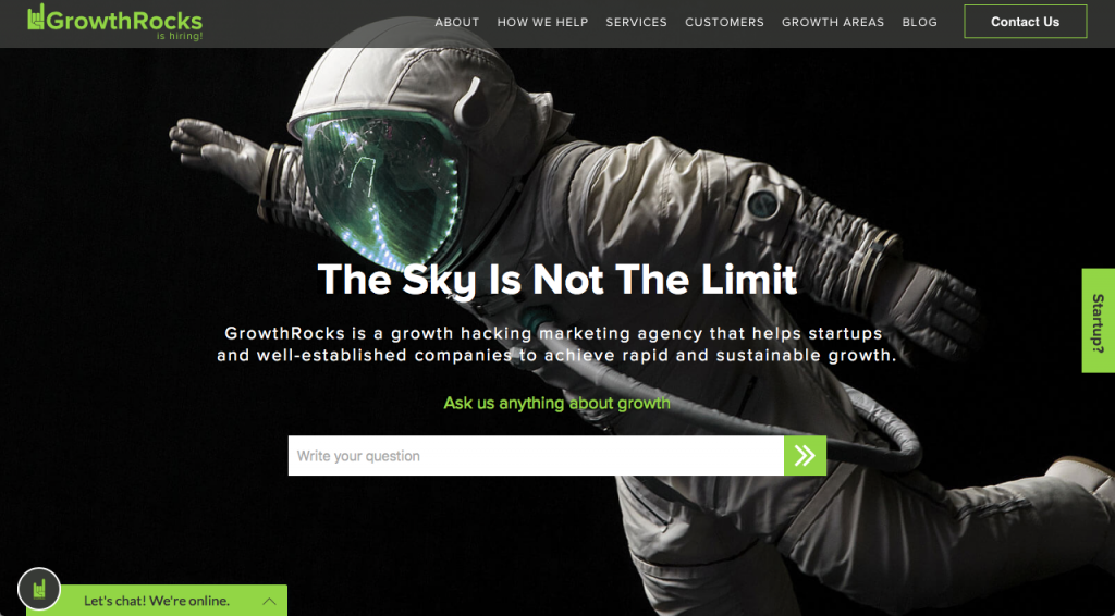
Make sure to make your homepage as flashy as possible. I strongly suggest smooth sliders or Videos.
Conversion rate optimization is about small changes on the site that will bring huge changes to your user statistics.
As you can see here we try to engage the user as much right off the bat. A little thingy that I love here is that as you move the mouse the astronaut does the same.
One of these silly little things that might win a customer.
The two widgets and the bar show our intention to answer any questions the user may have. Bounce is not an option at GrowthRocks.
2. One page layouts
This is something that I always take for granted, but given the amount of clients that seem to have a problem with this I thought that I should point it out.
And this impresses me because it should apply to many parts of your efforts. If you can go for a single page website it is a yes from me.
But even if you have a store. Make sure that you have a one-page checkout widget installed.
According to LEMONSTAND, a one-page checkout might even give you a 21.8% conversion boost.
3. Use the power of landing pages wisely
No, I am not crazy. Generally, I advise one-page layouts, but when you are promoting a specific campaign or want to focus on a strong trait of your product, nail at landing pages.
That mixes nicely with strategies like PPC or referral campaign.
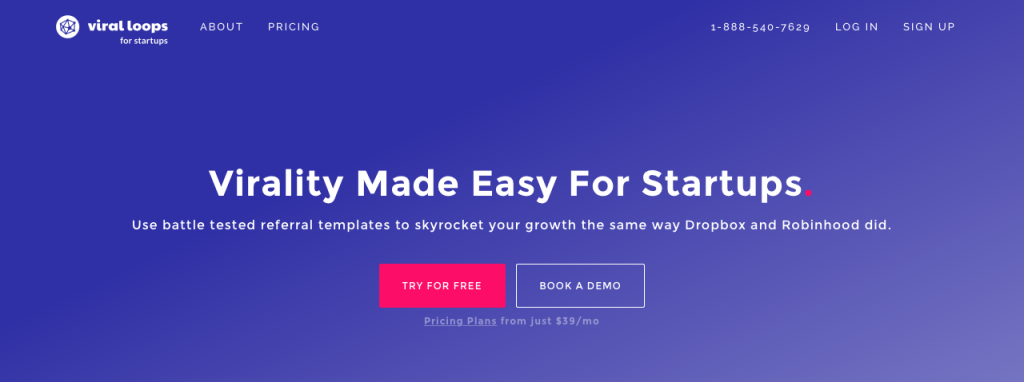
For example, when we are setting up campaigns with Viral Loops, our all-in-one referral marketing tool, we always set up a landing page, which always works in favor of our conversions.
4. Make sure that you have done proper branding
The type of visuals and content should always match your brand. Sometimes you can easily forget that and I even speak for myself.
I am a member of the organization team of TEDxPanteionUniversity. Among the other tasks sometimes I help with the visuals for social, site etc. Sometimes I found amazing mockups and worked a lot to make awesome visuals.
Some of my colleagues did not like them but they immediately told me that they were too corporate, or too childish and did not fit the TEDx brand.
Same goes for your product, let your visuals embrace your brand. You can always head to Drivethrubranding for some tips.
5. Get into the Widget-mania
Widgets are a nice and sneaky way to make someone do what you want.
There are various of them, others conquer the whole page, other a small box, other a bar at the bottom or header.
These widgets will help you boost your conversion for sure as they are sure to draw the attention and remind the ones visiting your web page something important.
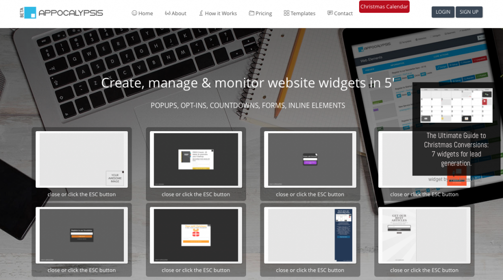
You can use them to gather emails, get people back to their cart, distribute freebies and pretty much everything.
I would strongly suggest heading over to Appocalypsis, a ridiculously easy way to create jaw-dropping widgets.
6. Do yourself a favor and use Plerdy Heatmaps
Heatmaps show you the hottest areas of your website. Where people click the most. This will in the long term show you exactly which of all the things you applied worked and which did not.
7. Be responsive for God’s sake
How many times do I have to write this down?!
Simple things like this can ruin your whole strategy. Always go for responsive themes.
Imagine someone who want to do shopping on his phone and no matter how much he wants he will never actually do it, because your theme will be messed up.
Not to mention that because we are all lazy f*cks, we would never go on that site for shopping even on a desktop.
8. Search field
People are overreacting over this one if you ask me. They support that a search bar is always a must. But it is my firm belief that it is not a huge booster.
Nevertheless every percent counts, so if this does the trick for you, give it a try.
9. Get rid of unnecessary element
The fact that your theme came with Unicorns farting rainbows across the screen does not mean that you should leave that feature active.
Always make sure to keep it simple and optimize the theme so that it fits your needs.
10. Focus your top optimizations around your “money”
This is a general tip that you might want to apply. Generally, aim for optimizations close to sections that will bring immediate revenue.
Carts, checkouts, landing pages etc.
That’s all folks. Conversion rate optimization is a bitch as anything else in life, but I am sure that you can handle it.
If you endured yet another one of my endless and pointless articles thank you very much and I am open to feedback, as always.
What are your top CRO tips? Please do share.
I try to constantly improve as a person and as a professional. I recently discovered the storyteller and growth hacker inside of me. Good research, commitment, and good visualisation constitute my work aesthetic.


